top of page

This project turned a silly logo idea for a friend into a brand identity for Camp Meier, a doggy daycare in Dearborn, MI.
Skills and software: creative direction, design, brand development, adobe creative suite, midjourney.

Meet Camp Meier's CDO (Chief Dog Officer), Teddy. Teddy serves as the inspiration for the brand. Many elements including the logo and icons were built with him in mind.

Teddy's ears
Teddy's nose (taking creative liberties on the shape)
Teddy's tail


BRAND IDENTITY
Below you can find primary branding elements such as logo(s), color palette, icons and typography. Each detail was carefully curated to the Meiers and their doggy day camp, even down to the color names.
MOCK-UPS
The most exciting part about creating Camp Meier's brand identity was building out all of the additional pieces to the brand. This includes camp flags and badges. The badges are intended to be printed as patches or stickers and distributed to each guest who stays at Camp Meier upon their departure.
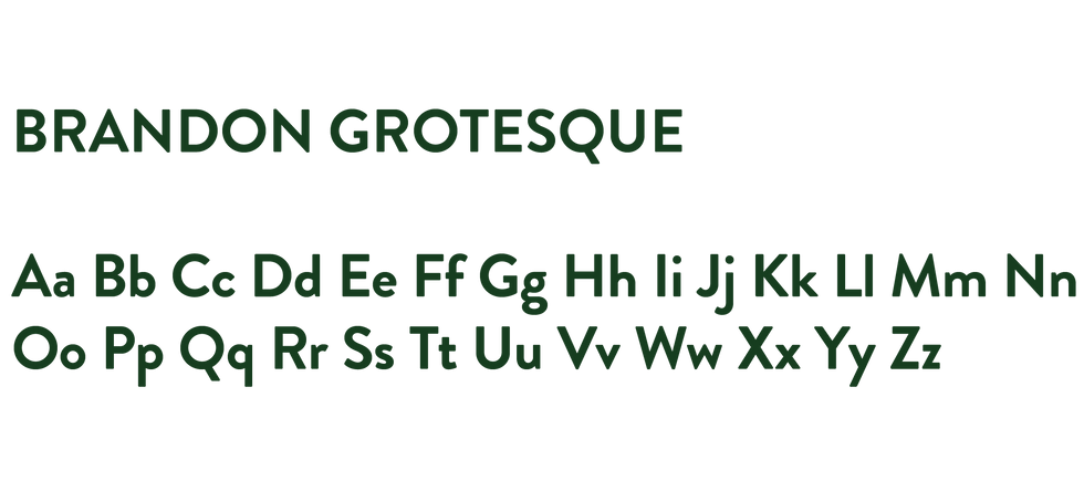
Typography
Camp Meier uses both a commercial font and custom typeface, that I created on Adobe Illustrator. The custom typeface is used in the logo and in short form text.


Color Palette
Camp Meier is fun and natural! This combination of colors relates to both the natural side of camp, while also providing a bright and colorful to caring for your furry friends.


bottom of page